You're viewing an archived page. It is no longer being updated.
Test Traffic Project Results
The Test Traffic Measurement Service (TTM) was shut down on 1 July 2014. This information is available for historical reference.
Plots of network delays
The test boxes that are on the net are named ttXY, where XY is a two-digit number. To find out which test-box is at your site, simply look on the front panel of the test-box. The test-boxes tt01-tt04 are at the RIPE-office in Amsterdam.
On the real page, you'll see a matrix that looks like this (with the hyperlinks actually working):
From: |
To: |
||||||||||||
|---|---|---|---|---|---|---|---|---|---|---|---|---|---|
tt01 |
XX Internet, Somewhere | Overview | tt02 | tt03 | tt04 | tt07 | tt08 | tt12 | tt13 | tt14 | tt15 | tt16 | |
tt02 |
XX Internet, Somewhere | Overview | tt01 | tt03 | tt04 | tt07 | tt08 | tt12 | tt13 | tt14 | tt15 | tt16 | |
tt03 |
XX Internet, Somewhere | Overview | tt01 | tt02 | tt04 | tt07 | tt08 | tt12 | tt13 | tt14 | tt15 | tt16 | |
tt04 |
XX Internet, Somewhere | Overview | tt01 | tt02 | tt03 | tt07 | tt08 | tt12 | tt13 | tt14 | tt15 | tt16 | |
tt07 |
XX Internet, Somewhere | Overview | tt01 | tt02 | tt03 | tt04 | tt08 | tt12 | tt13 | tt14 | tt15 | tt16 | |
tt08 |
XX Internet, Somewhere | Overview | tt01 | tt02 | tt03 | tt04 | tt07 | tt12 | tt13 | tt14 | tt15 | tt16 | |
tt12 |
XX Internet, Somewhere | Overview | tt01 | tt02 | tt03 | tt04 | tt07 | tt08 | tt13 | tt14 | tt15 | tt16 | |
tt13 |
XX Internet, Somewhere | Overview | tt01 | tt02 | tt03 | tt04 | tt07 | tt08 | tt12 | tt14 | tt15 | tt16 | |
tt14 |
XX Internet, Somewhere | Overview | tt01 | tt02 | tt03 | tt04 | tt07 | tt08 | tt12 | tt13 | tt15 | tt16 | |
tt15 |
XX Internet, Somewhere | Overview | tt01 | tt02 | tt03 | tt04 | tt07 | tt08 | tt12 | tt13 | tt14 | tt16 | |
tt16 |
XX Internet, Somewhere | Overview | tt01 | tt02 | tt03 | tt04 | tt07 | tt08 | tt12 | tt13 | tt14 | tt15 | |
These boxes were used to measure the network delays between each-other. By clicking on any element in the To: colomns of the matrix below, you can see the delays from a particular test-box to another test-box for a 24h, 7 day and 30 day period. For more details about these plots, click here. Clicking on the name of the sending test-box (the From:) colomn, returns the GPS Receiver conditions for this test-box. The overview column gives you a quick overview of all plots for the box.
The Overview Plots
The overview plots page looks something like:
Plots from/to tt01
| TTbox | INcoming traffic | OUTgoing traffic |
|---|---|---|
| tt02 | 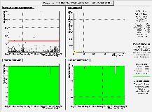 |
 |
| tt03 | 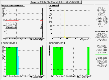 |
 |
| tt04 | 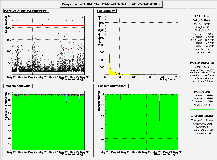 |
 |
The two columns show a reduced version of the 7 day plots for INcoming (tt02 to tt01, tt03 to tt01, ...) and outgoing (tt01 to tt02, tt01 to tt03, ...) traffic. By clicking on a particular plot, a new window is opened showing the 24h, 7 day and 30 day plots for that connection. This can be used as a quick way to spot problems.
About the delay plots
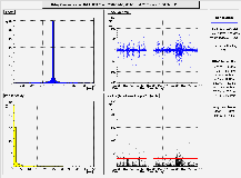
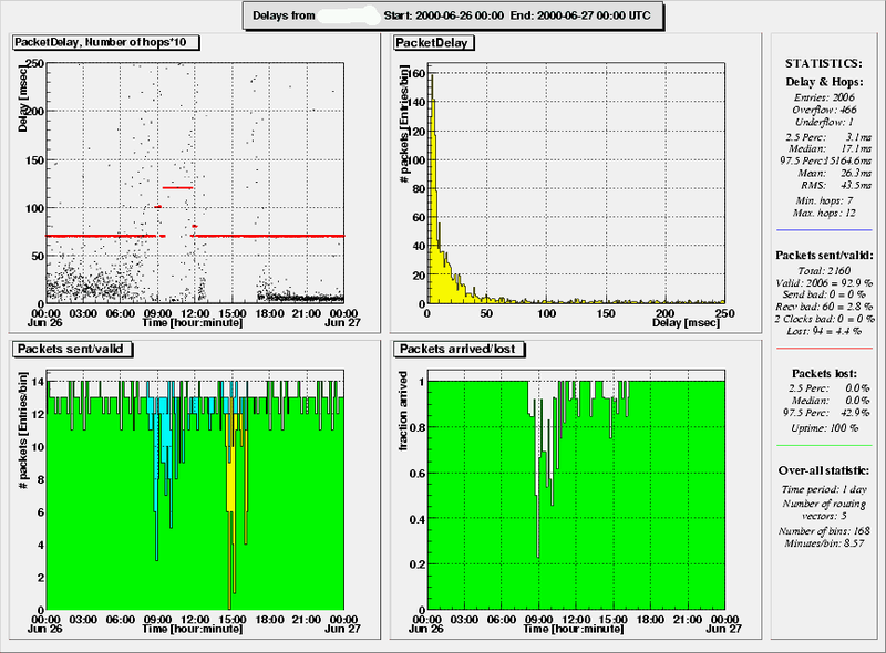
On these pages, you'll find 3 sets of 4 plots. A set typically looks like: 
At the very top, a header box lists the path (source & destination box) and time frame (start and end date) of the plotted measurements. On the right a statistics pad summarizes the results.
The 4 plots themselves show the following:
- Top Left plot: Delay & Number-of-Hops as a function of time
The black points show the delays as function of time. The red points depict the number of hops (times 10) detected in the closest preceding traceroute measurement; unless the number of hops is changing rapidly, these points will merge into line segments. Obviously, the number of hops only flags drastic changes in the routing; subtle differences like load balancing over multiple communication lines do not show up. For more detailed information on routing, the TTM traceroute database should be consulted. Note: The plot does not contain data-points with invalid NTP-time-stamps (see the explanation for the bottom left plot).
The number of entries, overflows (data-points with delays > 250 ms) and underflows (data-points with negative delays) as well as the 2.5 percentile, median and 97.5 percentile are listed in the statistics pad on the right. For completeness, we also report the histograms' mean and RMS (root-mean-square or standard deviation).
If there are lots of underflows, then this is usually caused by clock drifts. If the baseline appears to drift over time, then this is usually an indication of an experimental problem too. Before drawing any conclusions from the delay plot, make sure that you have checked the GPS-receiver conditions for both the sending and receiving machine. - Top Right Plot: Distribution of delays
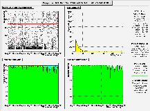
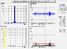
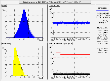
This histogram shows the distribution of the delays over the time interval of the previous plot, e.g. it is the projection along the y-axis of the previous plot. The number of entries, over- and underflows are the same as for the previous plot. - Bottom Left Plot: Packets sent
This figure consists of 5 histograms:- The green area shows the number of packets sent per bin of time with valid NTP time-stamps on both the sending and receiving side. A valid NTP time-stamp indicates that the receiver had synchronized itself to the GPS clock when the data point was measuered. Entries in the green histogram will show up in the delay plots. They are reported as Valid: in the statistics pad. The size of the bins (in minutes) is reported there too.
- The yellow area shows the number of packets sent per bin of time with a valid NTP time-stamp on the sending but not on the receiving side. These points will not show up in the delay plots, but are reported as Recv bad: in the statistics pad.
- The purple area shows the number of packets sent per bin of time with a valid NTP time-stamp on the receiving but not on the sending side. These points will not show up in the delay plots, but are reported as Send bad: in the statistics pad.
- The red area shows the number of packets sent per bin of time without valid NTP time-stamps on both the sending and receiving side. These points will not show up in the delay plots, but are reported as 2 Clocks bad: in the statistics pad.
- The cyan area shows the number of packets per bin of time that were lost. These packets left the sender but were not registered by the receiver, either because they were lost in the network or because the receiver was off-line. These points will not show up in the delay plots. They are reported as Lost: in the statistics pad.
- Bottom Right Plot: packet arrival as a function of time
For each bin of the bottom left plot, the bottom right histogram shows which fraction of the sent packets arrived at the destination box (regardless of clock status). When the experiment is not running, i.e. no packets sent, the 'fraction arrived' bins are set to 0. To distinguish between a situation of 100% packet loss, one will have to check the 'packets sent/valid' bottom left plot. The the total uptime of the sending process as a percentage of time is repored in the statistics pad.
The histogram is also summarized in the statistics pad: taking the percentage of packet loss in each bin (defined as 100 * (1 - fraction_arrived) ), we determine the 2.5 percentile, median and 97.5 percentile levels. In this example, the 97.5 percentile is 42.9% which means that 97.5% of all bins recorded a packet loss smaller than 42.9%. The median of 0.0% shows that at least half of the bins had no packet loss at all.
The plots are generated for the last 24 hours, the last 7 days and the last 30 days. They are updated once a day.
The Jitter Overview Plots
The overview plots page looks something like:
Plots from/to tt01
_
| TTbox | INcoming traffic | OUTgoing traffic |
|---|---|---|
| tt02 |  |
 |
| tt03 | 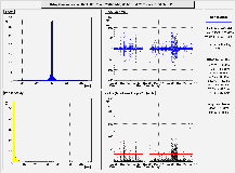 |
 |
| tt49 | 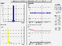 |
 |
The two columns show a reduced version of the 7 day jitter plots for INcoming (tt02 to tt01, tt03 to tt01, ...) and outgoing (tt01 to tt02, tt01 to tt03, ...) traffic. By clicking on a particular plot, a new window is opened showing the 24h and 7 day day plots for that connection. This overview can be used to get a quick view of the jitter patterns on all connections of a box and easily zoom in on the ones of interest.
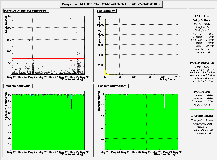
About the delay variation plots
On these pages, you'll find 3 sets of 4 plots. A set typically looks like: 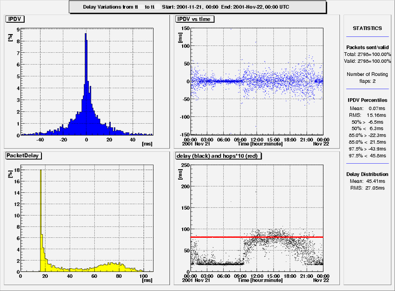
At the very top, a header box lists the path (source & destination box) and time frame (start and end date) of the plotted measurements. On the right a statistics pad summarizes the results.
The 4 plots themselves show the following:
- Top Left plot: distribution of delay variations This histogram shows the distribution of the delay variations (i.e. the difference between consecutive one-way delay measurements) for the specified time period.
- Top Right plot: delay variations vs. time This shows the delay variations as seen at the various times in the measurement period. The top left plot is the 1-D projection of this.
- Bottom Left and bottom Right plot: results of one-way delay measurements For easy reference, the results of one-way delay measurements used in the delay variation calculations are shown in the bottom plots. the bottom left plot shows the distribution, the bottom right plot shows the delay measurments vs. time. In addition, red dots indicate the number of hops (times 10) seen in the nearest traceroute measurement.
GPS receiver conditions
The accuracy of the local clock, and thus the accuracy of these measurements, depends on the number of satellites and the signal-to-noise ratio that the GPS receiver sees. At the very minimum, it should have seen the signals from at least 3 satellites for a few hours once at its present location, in order to determine its position. As long as the receiver is not moved after that, it should see the signal from at least 1 satellite all the time in order to keep its clock synchronized. 1 satellite is the absolute minimum, if it sees more satellites it will improve its position determination (which, in turn, improves the time keeping) as well as cross-check the information from the various satellites.
When the receiver has not determined its current position yet, or when it has lost contact with all satellites, then the local clock may slowly start to drift away from the correct time. After a while, NTP will detect this and start to return invalid time-stamps. However, before this happens, the delays may appear to slowly change over time even though nothing changes in the networks.
However, as long as the test-box sees at least 1 satellite (and the antenne is not moved), then this will not happen. This is why the test-boxes record the number of satellites that they see every 64 seconds. This information is binned and clicking on the name of the machine gives you a histogram with the number of satellites seen at 64 s intervals over a 24h, 7 day and 30 day period. Here is an example of such a plot:
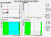
As you can see, most of the entries are in the (blue) bins around 3 and 4, which means that the receiver saw 3 or 4 satellites at that time. As we explained before, this is sufficient to keep the clocks synchronized. Here is another example:
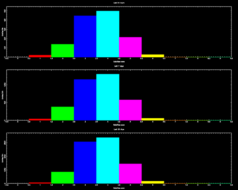
In the bottom plot, you see that there are lots of entries in the (white) bin around 0. This means that most of the time, the receiver did not see any satellites.
When you see a large number of entries in the bin around 0, it is recommended to find a better spot for the antenna. For this receiver, this happened during the last week: the 30 days plots shows lots of entries in the 0th bin but this disappeared over the last week.
Finally, number of satellites is an important factor to determine the quality of the local time, but it does not contain all information. We are working on a better way to express the clock quality.
More about the plots
- Scanning these plots takes a lot of time and, unfortunately, we do not check all plots on a daily basis. So, if you notice something strange or unusual in these plots, please send us a mail. Please include the date of the plot, the sending and receiving machine.
- However, please do not complain about missing or empty plots. The most likely reason for a plot to be empty is that we're not yet sending data between all pairs of test-boxes and, once a box is operational, it takes a few days before we have the data to fill all plots.